top of page
LIVE PLAYER DESIGN FOR A STREAMING PLATFORM
Onstream by

_edited.jpg)

Onstream is a platform-as-a-service that powers digital experiences for hotel management, staff and guests. Streaming and casting capabilities provide a modern guest entertainment experience while flexible system integrations help hoteliers personalize offers & increase efficiency.
My Role
UX Designer- Ideation, User flows, Wireframes, Visual Design, Design system
Team
Design Lead, Product Managers, Developers
Timeline and Status
2 weeks ( March 2023- April 2023)
Industry
Television, Hospitality
Overview
The brief was to redesign the player, for the platform. The main goal was to address the shortcomings outlined from user insights, research and interviews.
I led the end- to- end design direction of the player experience and also presented the design to cross functional teams.
The version designs were also shortlisted for The HTNG Techovation Award 2023, USA as Onstream platform was a semifinalist.
Context
The Problem
Through research and sales insights, the product team identified shortcomings in the current player, outlined user stories, and derived requirements, culminating in a clear problem statement
The existing live player lacks essential user functionalities for user control and customization including playback, navigation, recording and caption management.
Solution
Innovation without losing Identity.
I identified the potential of incorporating new features while maintaining visual identity of the current player and addressing its issues through strategic enhancements rather than complete visual overhaul.
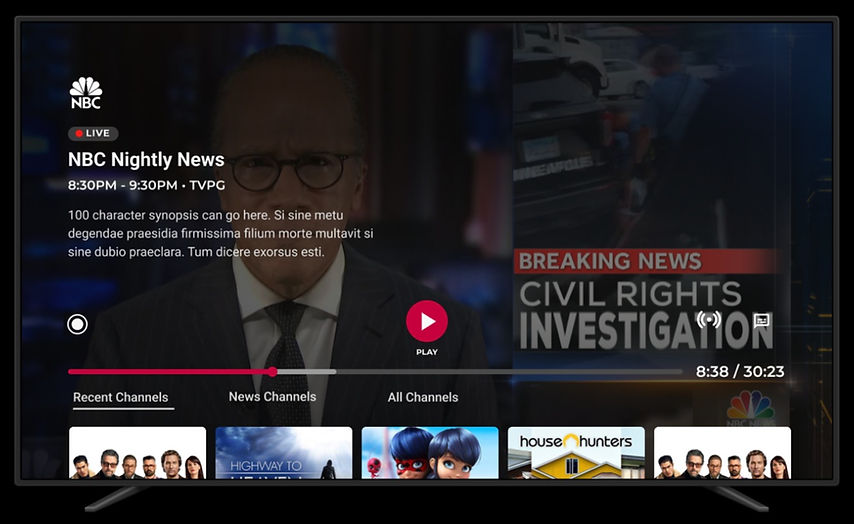
Miniguide in the form of a widget rail

How does this change help users?


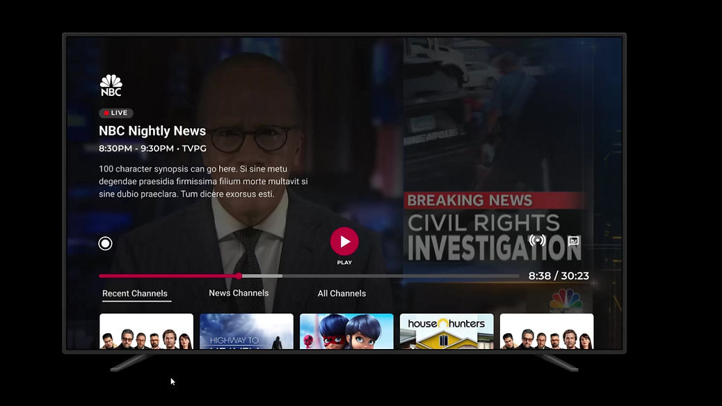
Recording in progress on a single click.
How does this change help users?

Research
But first, I stepped into the user's shoes.

As a live TV viewer, I want to control playback, record shows, adjust volume, manage captions, and exit the player easily.
"
"
The three phase approach goes a long way!


Observation
Understanding the depth of the problem.
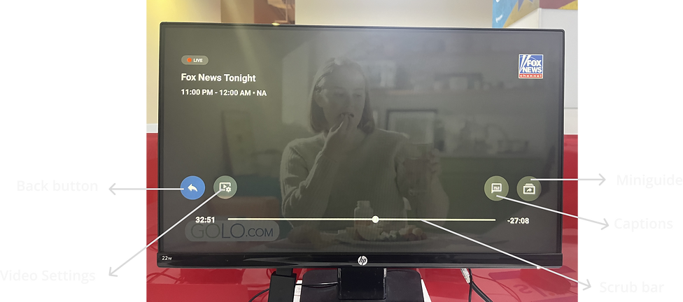
Live Player Onstream Version 3.0
Iterative observation
I decided to perform 3 tasks on the current live player design. Upon using the live player, I identified specific areas that might pose constraints and hinder user interaction, based on my personal observations.
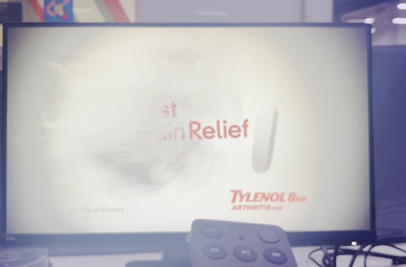
Task 1 :
Change channel using miniguide
-
Clicks - 3 ( Pause + right click + right click )
-
Time - 40 seconds
Task 3:
Exit Player
-
Clicks - 3 ( Pause + left click + left click)
-
Or click the back button on remote
-
Time - 18 seconds
Cognitive Walkthrough
More perspectives, richer insights.
I conducted a task analysis by assembling a group of developers and testing engineers within my office environment to conduct a comprehensive evaluation.
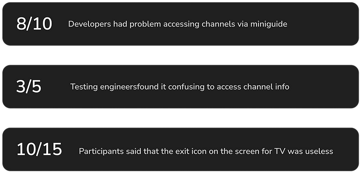
A Journey map to foster data driven decision making.

Based on the results of the analysis of user journey and usability testing conducted by us, we narrowed down 2 core problems faced by users.

Mini guide unclear

Redundant back button
Ideation
To kickstart the ideation process, I needed to reconcile the existing issues within the current live player with the new feature demands outlined by the product team.
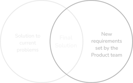
The learning curve.
Understanding 10 Foot Design Principles. As I earlier had an experience for designing on phone and desktop, designing for televisions was a bit overwhelming for me.

How did I overcome this?
Before beginning with the sketches, I spent time reading about the 10 foot design principles such as legibility, prioritizing user- friendly controls, adequate negative space and simplified input methods.
Iteration
Rapid Lines.
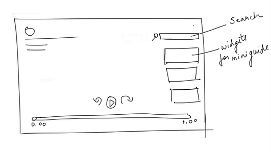.png)
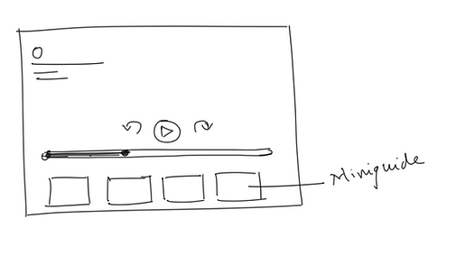.png)
Feedback and test
Initial team input - Involving product owners early
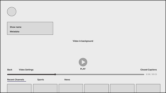

We liked the new miniguide design especially the genre filter feature
.png)
3 out of 9 individuals expressed concerns about the excessive number of widgets in the single rail.
- I changed mini guide to widget rail and added genre filters.

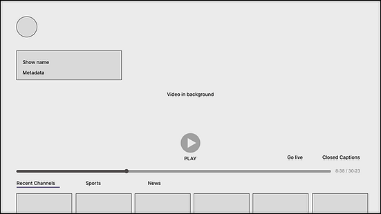
We are good with elimination of back button
.png)
4 out of 9 individuals suggested ensuring uniformity in the browser's back button design as well.
.png)
- A remote already has a back button, hence I eliminated the back button available on the screen, for TV designs only.
.png)

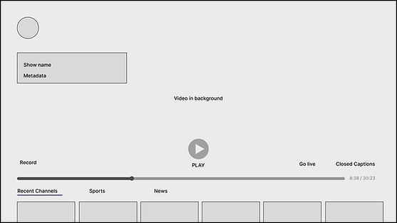
Happy with the easy record option and placement of the button
.png)
All 9 individuals indicated a lack of clarity regarding the recording duration for shows.
- While enjoying a live show, the viewer has the convenient option to instantly capture and record it with just a single click. This recording can then be conveniently accessed and enjoyed for future viewing purposes.
Based on the feedback, I engaged in iterative design refinement to develop well optimised and user-centric final solution.
Final Design
The wait is over!
As this project constitutes a feature redesign of the existing live player, there haven't been any modifications related to the design system. As a result, all elements such as colors, typography, icons, and more, have been directly sourced from Dish's design system.
*As per NDA, I'm not allowed to disclose the details about the design system*

Closed captions button
Go Live
Record Button
-
Miniguide pops up when a video is paused
-
Channels with their respective posters are visible
-
Filters for channels are also available to help users navigate quickly.
Say hi to the new live player!


Impact
Adding value to the business.
The new live player designs were a part of Onstream version 3.1. After phase 1 of user testing it was observed at 70% of the participants found it easy to navigate through channels and record them for future use.

This version designs were also shortlisted for The HTNG Techovation Award 2023, USA and Onstream platform was a semifinalist.
What I learned along the way?
1. Honoring core design language for seamless user transition: I learnt how this consideration isn't just a matter of aesthetics but a strategic move for a smooth transition of veteran users. Change can be unsettling, hence this approach balances between innovation and user centricity.
2. Balancing user needs and product goals: I cultivated the ability to bridge the gap between user requirements and objectives set by the product team. This learning helped me create solutions that blend user satisfaction with project goals, ensuring an effective outcome.
bottom of page